
最近(20201014)Uniapp官方在HBuilderX 2.9.3版本更新中,增加了PC宽屏适配的功能,在写下本章时该功能只支持H5端,这章来尝尝鲜。
官方文档介绍得很详细,这章我打算以我的看法来介绍。
目前适配主要大致分为两种:
- 框架级适配 – 在
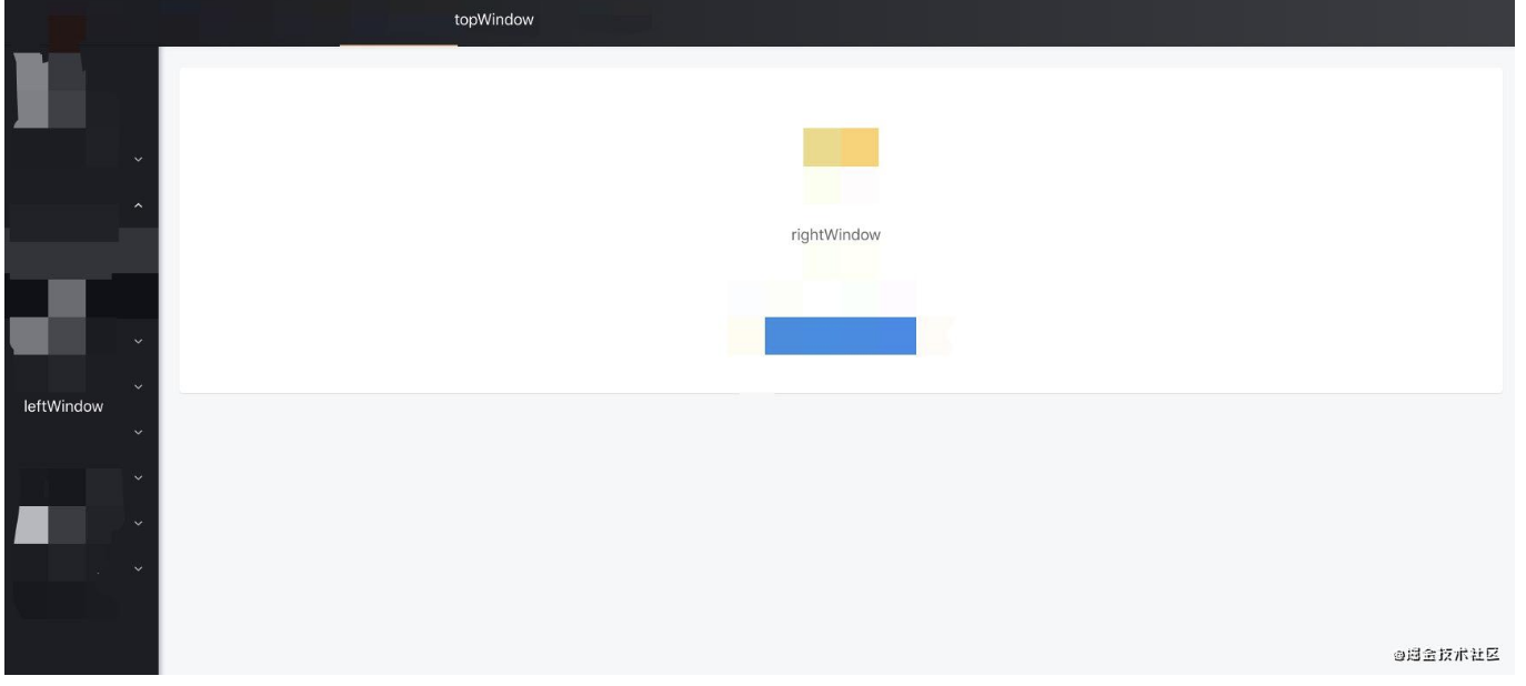
page.json增加配置项,可选有leftWindow、rightWindow、topWindow - 组件级适配 – 使用
match-media组件
# 框架级适配
leftWindow、rightWindow、topWindow,顾名思义就知道代表左右上的位置,从用户体验和产品角度,这种模式对使用范围还是有所约束,适合上导航,左分类,右内容的布局,对,我说的就是后台管理系统。
首先,在page.json里加入配置:
{
  "globalStyle": {

  },
  "topWindow": {
    "path": "responsive/top-window.vue", // 指定 topWindow 页面文件
    "style": {
      "height": 60
    },
    "matchMedia": {
      "minWidth": 0
    }
  },
  "leftWindow": {
    "path": "responsive/left-window.vue", // 指定 leftWindow 页面文件
    "style": {
      "width": 300
    }
  },
  "rightWindow": {
    "path": "responsive/right-window.vue", // 指定 rightWindow 页面文件
    "style": {
      "width": "calc(100vw - 400px)" // 页面宽度
    },
    "matchMedia": {
      "minWidth": 768 //生效条件,当窗口宽度大于768px时显示
    }
  }
}
@前端进阶之旅: 代码已经复制到剪贴板
然后建立目录和文件responsive/right-window.vue,加入用于显示右内容的代码:
<!--responsive/right-window.vue-->
<template>
  <view>
    <pages-detail-artDetail ref="detailPage"></pages-detail-artDetail>
  </view>
</template>